Posts

Showing posts with the label google earth

Have you tried Google Fusion Tables?

Apart from the awesome Google Maps and Google Earth. Did you know that you could embed your spatial data in Google Fusion Tables? Google Fusion Tables is meant for visualizing your data in a spreadsheet. It produces cool charts (bar, pie, scatter, line) for just about any formatted table you have. You may input a spreadsheet directly from your Google Docs or you may also opt to create a new table from scratch. the steps are easy, just follow the step-by-step instruction at http://www.google.com/fusiontables / . Here's a cool line chart that I have created before. It shows the series of oil price hikes since we bought a car last year. It gives me an idea where our next gas refilling station will be. Pretty neat display too. And kudos for it being interactive. Yay! Now for the geospatial people/geek, you might want to try using this Google Fusion Tables for visualizing your latest database. As long as you have some data with spatial components i.e. geographic coordinates (...

How to view shapefiles in Google Earth

Image
I have tried it in ArcGIS 9.3. In Arc Toolbox choose Conversion tools > To KML then choose the layer that you want to convert then choose scale as 1 if your data is currently in WGS84 projection. It will be saved as a zipped kml file (.kmz) because you chose to save a layer of your map document. Just double click the output kmz file and there you go. Here's a screenshot of my sample shapefile (Isabela, Philippines) as viewed from Google Earth. In one of my graduate course project, we have studied dengue and identify high, medium and low risk areas in  Quezon City, Philippines. We have also included the Google Earth upload of our output layers as part of our methodology. Here's a sample shot showing how the fields and attributes are preserved after exporting the shapefile to kmz. Dengue Hotspots in Quezon City, Philippines So there you go. I'll be posting too on how to work the other way around; from KML to SHP next time. Enjoy googling (^_^).

Principal Components Analysis

Image
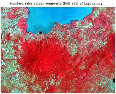
 Principal Component Analysis (PCA) aims to eliminate the interband correlation and the effective dimensionality of the data or image. The false color composite of the original Laguna.img file appears below. Fig. 1: Standard color infrared composite image   The satellite image from Google Earth of Los Banos, Laguna was also included for identification of features and their names. Fig. 1a shows the saved image. Fig.1a: Google Earth image of Los Banos, Laguna   After subjecting the original image to principal components analysis, a color composite using PC1,PC2,PC3 as R,G,B respectively was produced. The color composite image was shown in the figure that follows. Fig. 2: RGB = PC1,PC2,PC3 of Laguna.img The six principal component grayscale images appear below. Fig. 3: Output principal component images  The tonal patterns of the principal component image 1 differ with that of ETM+ band 1 of Laguna.img. Figure 4 shows the a generlized view of the sa...